

About Buddy Up
Buddy Up is an app meant to help people who want to do an activity but don’t have someone to do the activity with. Users turn away from activities due to fear or anxiety of doing things alone, sometimes due to low self-esteem. Buddy Up looks to break users from that fear and help them connect with other users looking for the same—looking to build community!
Problem
People who find themselves overwhelmed or scared to do activities alone are more willing to do them if they have a buddy.
Google is a tool that a lot of people lean on to help them research what they need to know before any activities; however, naturally, Google and similar websites provide so many options, articles, and links to read, and just like anything else in our lives, we like to have information provided to use easily and quickly; not having to read through an entire article to know the ins and outs and the where and when to do something helps the users connect.
Solution
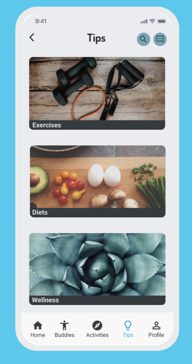
I created an accessible mobile app to help people and their activity journey, a journey to find themselves a buddy to go out on activities and build community while also providing healthy tips like different types of diets, meditation, and exercise routines. We lead busy lives, so I decided to implement a nearby me finder feature for buddies and activities that help make it easier to find people and/or activities for the user to do, share with other users, and/or save for later access.
Process
User Research & Synthesize
Ideation
Sketching
Wireframing
UI Design & Prototype
Role
Sole UX/UI Designer
Project Details
Project Duration: 8 weeks
Platform
Mobile
Tools
Miro
Figma
InVision


1. Research
1.1 Secondary Research

For my secondary research, I utilized 7 different articles. I mainly focused on the information people search for when they want to do an activity, don't want to do it alone, and need the motivation to do it. And "according to an article in Fitness Life Advisor, most problems are caused by a lack of time, accountability, discipline, knowledge, support, and/or self-esteem." Also, according to New Delhi Television, "People who exercise don't have any more or less time than people who don't. The only difference is that they carve out that time. They make working out important."

1.2 Primary Research
I recruited people through Social Media, Slack, and word of mouth, and with the screener survey, I got an insight into how users go about doing activities with other people. After interviewing them and collecting more data, I synthesized my findings into affinity groups, empathy maps, and personas.
1.3 Screener Surveys
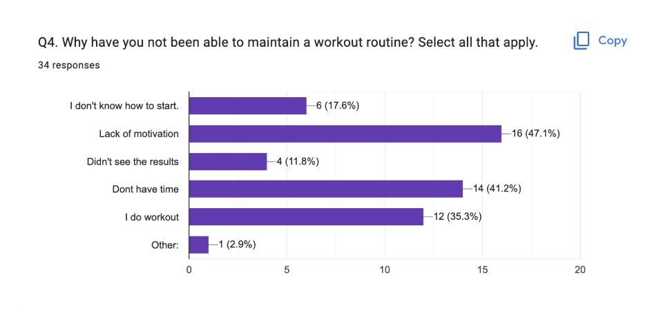
A total of 34 participants were surveyed. People were recruited through Social Media, Slack, and word of mouth. When creating the screener survey, the main objective was to find participants that have had difficulty finding people to go out and do an activity, as well as those participants that just wanted to know more about activities happening near them, participants that wanted to build community and/or participants that just wanted to be more active and fit.
1.4 Interviews
I conducted 5 user interviews to get a better understanding of how users would find the correct information about current or past activities, how they will try and meet people to plan an activity, and how the experience has been.
Major Takeaways:
People don’t know how to start searching for activities or people to do them with.
They don’t get the experience that they want or expect.
They lack motivation.
The lack of support.
No accountability.
They don’t have time.
1.5 Affinity Mapping
After conducting interviews, I wrote down notes and organized them by theme. I was able to group these notes to create an affinity map and group the qualitative data using 101 sticky notes.


1.6 Empathy Mapping
I developed a core persona, The Planner, from my interviews and synthesis. These helped us to better understand the end users and form the user Persona, which would be our lens into how users would interact with our product.
1.7 Personas
After a deeper look into the empathy map, the personas were formulated from a results review, idea, empathy & affinity mapping process. They formed the foundation for how we would go about generating ideas, evaluating design decisions, and a view through which we'd conduct spot functionality testing of our designs.
Kyle: a program coordinator who is extremely busy and needs to meet people to be more active, build community, have better habits, and be healthier

1.8 How Might We
The final piece of my research was synthesizing this data with How Might We (HMW) statements to communicate the most important problems users want to solve clearly. Writing HMWs was easy with all the findings during my discovery thus far. HMWs generate creative solutions while keeping my focus on the problem to solve.
How might we help users connect with others to go out on activities?
HMW help people learn about healthy habits?
HMW help users create a community?
HMW make people structure their day better?
HMW help people be and stay motivated?
HMW help create better awareness for health?
2. Ideation
After focusing on HMW’s, it was time to ideate and began sketching screens to find possible solutions to the user problems. All the research and data provided me with enough insights to start sketching to generate ideas and establish concepts to tackle the user’s problems.
2.1 User Stories
Before I could start designing, I had to identify the most important functions this app needed. User stories were categorized by priority, the highest being the most crucial function. This helped me understand the necessary features and elements that needed to be implemented for a smooth experience.
High - Must Have
As a user, I want to find other people in the same situation as me and be able to go out on activities.
As a user, I want to learn the basics of being healthy and active to have more energy, better health, and self-esteem.
As a user, I want to create a login account to have my information, communicate with my buddies, and track my activities.
Medium - Nice To Have
As a user, I want to see the proximity of the nearest activity location so that I can meet with others.
As a user, I want a bedtime reminder for a better sleep cycle.
As a user, I want to be able to find places to go and be active with others so that I can create a community based on the same interests.
Low - OK Not To Have
As a user, I want to see areas where outdoor sports are permitted so that I can practice them.
As a user, I want to compare the progress of others so that I can be more competitive.
As a user, I want to be able to keep track of my progress so that I can see how it differentiates from the beginning.
2.2 Sitemap
Now that I had a better idea of what my user needed, I created the sitemap with the intent of simplicity. Finding activities and communicating with other buddies do not need to be complicated, and I did not want to create an overwhelming experience for the user. With this in mind, I knew I wanted users to have a smooth, minimalist, and easy experience.


2.3 User Flow
My user flows helped me understand how I wanted each screen to be laid out for the user to complete their tasks. From my MVP, I chose three essentials to Buddy Up: to find nearby buddies, activities, and different types of healthy tips like diets and recipes.
2.4 Sketches
Sketching helped me bring those user flows to life, realizing quickly that I did not want many illustrations on screen, as well as a compact navigation menu. I wanted the experience to be simple, smooth, minimalistic, and peaceful. After a few sketches, I was happy with the direction that I was headed.


2.5 Low Fidelity Wireframes
Using my sketches as a guide, I began working in Figma and brought those sketches into low-fidelity wireframes; doing so helped clarify how I wanted functions spaced out on screen and gave me a much better insight into how I could simplify and prioritize functions.


3. Design
Now that the app has a flow and structure to it. I wanted to keep the style simple and minimal. I did not want my iconography to outshine the information being displayed. Since this is a find a buddy to do activities with, I decided to go with calm colors that reflect peace and ease of use.

3.1 Moodboard
I first created a moodboard to get some inspo for the app and the High-Fidelity Wireframes. I wanted to ensure that I designed an empathetic and friendly vibe for this project. I chose imagery that conveys a chill, peacefulness, and camaraderie to be able to clear a daunting task and provide warmth and a welcome vibe for this project.
3.3 Style Guide
A style guide is key to brand recognition and understandable usability. I developed a style guide to make my design consistent throughout, creating a seamless user experience. The colors chosen provide a sense of calm and ease of use. I want the app to use less shadow and more light with cool, welcoming colors, that way, it conveys a peaceful and friendly vibe.

3.4 High Fidelity Wireframes
With the use of my style guide, I began to build my high-fidelity screens. I focused on making the content easily accessible and easy to understand. By giving descriptive information, categories and intuitive flow.


4. Testing
4.1 Prototype
Using Figma and InVision, I developed a prototype and cleaned up any small spacing, color, misspellings, functionality, and user error before testing with any users.
Prototyping helped me understand the users' issues; for example, they had no clue what they were logging into or how the recipes didn't have any instructions.
The prototype was done with Invision, but unfortunately, they shut down at the end of 2024.
4.2 Usability Testing
I was ready to test the app and conduct usability testing. I wanted to evaluate how users would complete tasks, the design, and how they would navigate throughout the app. All participants had taken the screener survey and were contacted to conduct the testing.
Many users were intrigued to know how to use other aspects of the app that were not developed or prototyped yet; however, they were redirected to the task at hand.
Test Questions:
Will the user understand how to find a buddy and communicate with them?
Will the user be able to find activities and save them, share or go to them?
Can the user find his favorite healthy diet and see meals for that day?
Can users find different tips?
Tasks:
Find a buddy and communicate with them about an activity.
Find an activity near you and save it for later.
Find a recipe for you to save and make later.
4.3 Usability Testing Results
Testing Results:
Overall the users found Buddy Up reasonably easy to use and understand. The testing did allow me to identify some problems to be addressed.
Issue 1 - The users didn’t know what they were Logging into.
Summary:
Most users felt it was a standard login screen, but the lack of images didn’t make it clear or easy to understand what the users were getting into.
Issue 2 - Home Screen, you couldn't see My Buddy List
Summary:
On the home screen, there is a container displaying the user's number of buddies. Most users click on it and can't see their buddies.
Issue 3 - The recipes screen lacked info.
Summary:
The recipes screen didn’t have instructions, and a few ingredients came pre-selected, making the user confused about why they were pre-selected.
4.4 Synthesize & Redesign
Solution Issue 1:
I decided to add illustrations and make the app's name stand out more. Solution Issue 2:
Solutions Issue 2:
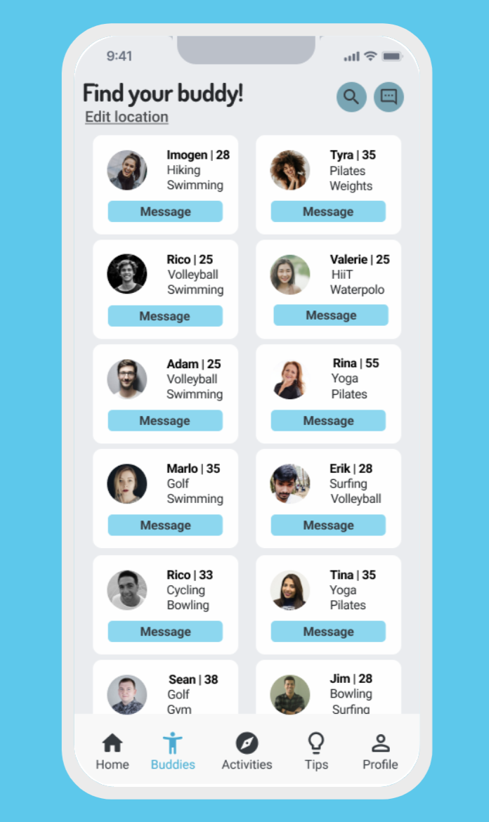
I made a new feature for the users to be able to see their current buddies and be able to message them to plan an activity.
Solution Issue 3:
The recipes screen now has a nice container that displays the ingredients needed, plus a nice toggle button to show the instructions to make the recipe.
4.5 Redesign
After gathering all participant’s feedback, I was then able to redesign to arrive at my final UI design


5. Reflection
5.1 Conclusion
I learned a lot from designing Buddy Up. I'm happy that the final product came out as intended. As this project's sole UX Researcher, UX, and UI designer, I have learned much from every step and developed a better human-centered design approach. I have learned how to be a better researcher and designer.
The biggest challenge I faced was the recruitment and testing of the prototype. This part was challenging because everyone had busy schedules, and I had to juggle everyone's requests. However, the experience gained from organizing this has helped me become a better and more rounder UX and UI designer.
This experience led me to learn new UX/UI design aspects. I am eager to learn new tools, techniques, and methods to make my designs a better experience for users. There are many more problems that users face daily that need solutions. Through this experience, I will be able to improve my design so that users experience that world to the fullest. If I continue this project, I would like to deploy it in the real world and gain more in’ needs.