

About Kernel Fresh
The Kernel Fresh Digital Purchasing Experience aims to transform how customers shop for skincare products online. Currently, users face difficulties with poor navigation, unclear product descriptions, and a lack of guidance, leading to frustration and abandoned carts.
This redesign focuses on improving usability, simplifying navigation, and integrating AI-driven recommendations. By implementing better filters, tailored product descriptions, and interactive chatbot assistance, the platform will create a smoother and more intuitive shopping experience—helping users find the right skincare products effortlessly.
Problem
Kernel Fresh customers face several digital purchasing challenges that impact their shopping experience. The website suffers from complex navigation, lack of personalized recommendations, and an inefficient checkout process. Customers find it difficult to discover products, access relevant details, and complete their purchases smoothly. As a result, user frustration leads to higher drop-off rates and missed sales opportunities.
Solution
We redesigned the Kernel Fresh digital platform to enhance usability and optimize the purchasing journey. By implementing a streamlined navigation system, AI-powered product recommendations, and a simplified checkout process, we ensure a seamless user experience. Additionally, improved product descriptions and customer reviews help shoppers make informed decisions. These enhancements increase customer satisfaction, boost engagement, and drive higher conversion rates.
Process
User Research & Analysis
Competitive Benchmarking
Ideation & Brainstorming
Wireframing & Prototyping
Usability Testing & Iteration
Role
Sole UX/UI Designer + Developer
Project Details
Project Duration: 10 weeks
Platform
Mobile and Web
Tools
Figma
Miro
ChatGPT
Notion
Google Analytics


1. Research
2. Ideation
3. Design
4. Reflection
1. Research
1.1 Secondary Research
For my secondary research, I analyzed industry reports, market trends, and competitor platforms to understand the challenges users face in purchasing skincare products online. Research indicated that many consumers hesitate to buy skincare digitally due to concerns about product transparency, confusing navigation, and an overwhelming checkout process.
According to a study by Consumer Trends Insights, 60% of users prefer clear product descriptions and ingredient transparency before purchasing skincare online, and 40% of abandoned carts in skincare e-commerce are due to a complicated checkout experience.
Additionally, a report by Retail Analytics Weekly found that 70% of customers expect personalized skincare recommendations when shopping online, yet many beauty brands fail to implement AI-driven personalization. By leveraging UX-focused digital enhancements, businesses can transition from basic online retailing to an optimized, customer-centric experience, improving trust, engagement, and conversion rates.
A survey from E-commerce Innovation Report also revealed that skincare platforms integrating AI-driven product recommendations and detailed ingredient insights see a 35% increase in repeat purchases and a 25% boost in customer satisfaction. These insights reinforce the need for Kernel Fresh, a redesigned digital skincare shopping experience that prioritizes clarity, personalization, and user trust.


1.2 Primary Research
To understand the challenges and expectations of online skincare shoppers, I conducted user interviews, surveys, and direct outreach to potential Kernel Fresh customers. My goal was to identify how users discover, evaluate, and purchase skincare products online, as well as their pain points and motivations.
The survey revealed that:
35% of respondents were first-time skincare buyers, who struggled with product selection and lacked trust in online descriptions.
25% were skincare enthusiasts, actively looking for detailed ingredient lists and personalized recommendations.
20% were budget-conscious shoppers, prioritizing affordability and clear pricing.
15% were brand-loyal customers, who value product reviews and loyalty programs.
5% were impulse buyers, influenced by discounts and social proof.
1.3 Screener Surveys
A total of 65 participants were surveyed, all of whom were potential or existing Kernel Fresh customers. Participants were recruited through social media groups, online skincare communities, and direct referrals. The screener survey was designed to identify common challenges in online skincare shopping and understand barriers to digital purchasing confidence.
The primary goal was to pinpoint why users struggle with buying skincare products online. The results showed that:
33 respondents (50%) cited unclear product descriptions as their biggest challenge, making it difficult to choose the right product.
29 respondents (45%) reported a lack of detailed ingredient transparency, leading to concerns about product suitability.
26 respondents (40%) faced difficulties in finding personalized recommendations, causing frustration in decision-making.
23 respondents (35%) relied heavily on reviews and social proof but often found them lacking or untrustworthy.
13 respondents (20%) expressed concerns about checkout complexity, contributing to abandoned carts.
By analyzing this data, I was able to identify key user pain points and validate the need for Kernel Fresh's UX improvements. The insights gathered from this screener survey informed the design decisions, guiding the development of a clear, personalized, and seamless skincare shopping experience.

1.4 Interviews
I conducted five in-depth user interviews with potential and existing Kernel Fresh customers to gain a deeper understanding of their challenges and experiences with purchasing skincare online. The goal was to identify pain points in their shopping journey, understand how they make purchasing decisions, and assess their trust in digital skincare recommendations.
Major Takeaways
Many users expressed frustration with overwhelming product choices and the lack of personalized guidance when shopping for skincare online. Some of the most common themes that emerged included:
Unclear product descriptions – Users found it difficult to understand skincare ingredients and their benefits.
Price sensitivity – Many customers hesitated to purchase due to unclear pricing structures and a lack of bundled discounts.
Difficulty in choosing the right product – Without personalized recommendations, users struggled to match products to their specific skincare needs.
Skepticism about product effectiveness – A lack of verified customer reviews and testimonials made it hard for users to trust certain products.
Complicated checkout experience – Some users abandoned their carts due to multiple steps or unclear payment options.
Limited post-purchase engagement – Users wanted follow-ups, skincare tips, and loyalty incentives to feel more connected to the brand.
These findings helped shape Kernel Fresh's UX strategy, ensuring the platform addressed real user concerns, particularly by offering clear product information, AI-driven recommendations, and a simplified shopping experience.
1.5 Affinity Mapping
After conducting interviews, I documented insights and organized them into key themes to identify recurring pain points and user needs. By grouping these notes, I was able to create an affinity map that categorized the qualitative data into actionable insights.
The mapping process helped me uncover five core themes from the research:
Predictive Maintenance Gaps
Operational Efficiency Concerns
User Trust in AI
Data Overload & Accessibility
Integration Challenges
By synthesizing these insights, I ensured that ADIS directly addresses user concerns by offering real-time AI-driven maintenance recommendations, predictive failure detection, and intuitive dashboards that simplify data interpretation for technicians and plant managers.


1.6 Empathy Mapping
I developed a core persona, The Planner, from my interviews and synthesis. These helped us to better understand the end users and form the user Persona, which would be our lens into how users would interact with our product.
1.7 Personas
After a deeper look into the empathy map, the personas were formulated from a results review, idea, empathy & affinity mapping process. They formed the foundation for how we would go about generating ideas, evaluating design decisions, and a view through which we'd conduct spot functionality testing of our designs.
Kyle: a program coordinator who is extremely busy and needs to meet people to be more active, build community, have better habits, and be healthier

1.8 How Might We
The final piece of my research was synthesizing all gathered insights into How Might We (HMW) statements, helping to reframe user challenges as opportunities for innovation. Writing HMW statements allowed me to clearly define the most pressing user pain points while keeping my focus on problem-solving. These statements serve as a foundation for ideation and solution development in predictive maintenance and AI-driven maintenance optimization.
How might we help maintenance teams transition from reactive to predictive maintenance?
How might we simplify AI-generated insights so technicians can take action without extensive training?
How might we reduce unplanned downtime by providing real-time failure predictions?
How might we integrate AI-powered maintenance seamlessly into existing legacy systems?
How might we increase user trust in AI by making predictions more explainable and transparent?
How might we provide maintenance managers with a clear, data-driven view of asset health and performance?
How might we ensure maintenance schedules are optimized to reduce costs without compromising efficiency?
How might we help organizations overcome the challenge of data overload by delivering only the most critical alerts?
2. Ideation
After focusing on HMW’s, it was time to ideate and began sketching screens to find possible solutions to the user problems. All the research and data provided me with enough insights to start sketching to generate ideas and establish concepts to tackle the user’s problems.
2.1 User Stories
Before I could begin designing, I needed to identify the most essential functions for the AI-powered maintenance solution. To prioritize the most critical features, I categorized user stories into three levels of importance—high, medium, and low. This helped structure the necessary elements that needed to be implemented for a seamless user experience.
High - Must Have
As a maintenance manager, I want to receive real-time AI predictions about potential equipment failures so that I can prevent unexpected downtime.
As a technician, I want to have clear, step-by-step troubleshooting guides based on AI recommendations so that I can efficiently fix issues.
As a plant operator, I want to track asset performance and maintenance history so that I can ensure machines are running optimally.
As an executive, I want to see AI-driven reports with actionable insights so that I can make data-driven decisions to optimize costs.
As a maintenance planner, I want the AI to automatically suggest the best time for maintenance so that I can reduce unnecessary servicing.
As a user, I want an easy-to-use dashboard that simplifies AI predictions into clear recommendations instead of overwhelming data.
Medium - Nice To Have
As a technician, I want to receive mobile notifications when a machine is at risk of failing so that I can respond quickly.
As a maintenance manager, I want the ability to simulate different maintenance scenarios so that I can test AI recommendations before applying them.
As a plant operator, I want to filter AI-generated insights by priority so that I can focus on the most critical issues first.
As a decision-maker, I want the AI system to provide explanations for its recommendations so that I can trust the predictions.
As a maintenance planner, I want the AI to predict the estimated lifespan of machine parts so that I can plan ahead for replacements.
As a team lead, I want the AI system to provide performance insights on my technicians so that I can identify areas for improvement.
Low - OK Not To Have
As a technician, I want to compare maintenance trends across different facilities to see how my plant performs relative to others.
As a user, I want the AI system to gamify maintenance efficiency, awarding points for quick fixes and accurate troubleshooting.
As an executive, I want to forecast long-term AI-driven maintenance cost savings based on historical data.
As a maintenance manager, I want to export AI-driven maintenance reports in multiple formats for external audits.
As a technician, I want a chatbot interface where I can ask AI for troubleshooting advice in real time.
As a user, I want the AI to suggest third-party suppliers for replacement parts.
2.2 Sitemap
Now that I clearly understood the user's needs and goals, I structured the ADIS Industrial Monitor software sitemap to provide a smooth and intuitive navigation experience. The main objective was to ensure that maintenance teams, technicians, and managers could quickly access critical information without unnecessary complexity.
The sitemap was designed with hierarchical navigation, organizing features based on their importance and usage frequency. Given that predictive maintenance requires real-time monitoring, historical insights, and actionable recommendations, the software structure was developed to offer clarity, efficiency, and ease of use.


2.3 User Flow
Understanding how users navigate through ADIS was essential in optimizing the system for efficient monitoring and predictive maintenance. By mapping out key user interactions, we ensured that critical alerts, system diagnostics, and maintenance scheduling were intuitive and accessible.
2.4 Sketches
Sketching played a crucial role in shaping the user flows for ADIS, helping me visualize the navigation and interactions needed for real-time monitoring and predictive maintenance. I quickly realized that the interface needed to be clean, intuitive, and data-driven, with a focus on critical alerts and system efficiency.


2.5 Low Fidelity Wireframes
Using my sketches as a guide, I began working in Figma and brought those sketches into low-fidelity wireframes; doing so helped clarify how I wanted functions spaced out on screen and gave me a much better insight into how I could simplify and prioritize functions.


3. Design
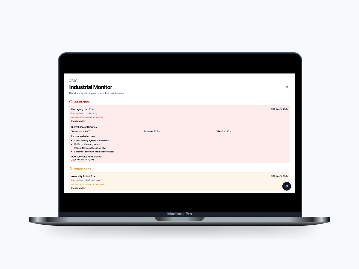
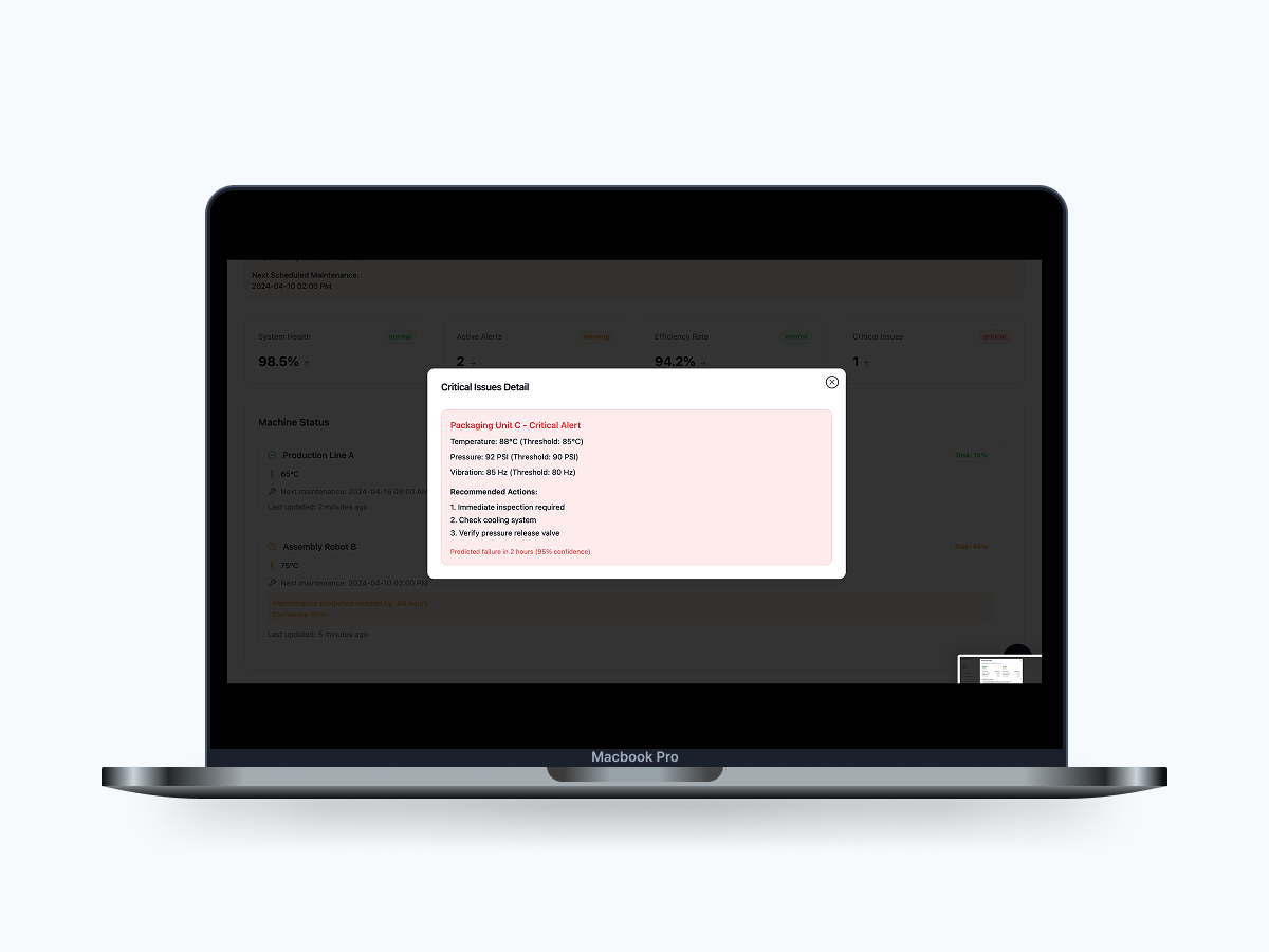
Now that the software has a structured user flow, the focus shifted to refining its design. The goal was to keep the interface clean and minimal, ensuring that data visualization and alerts remained the primary focus. Given that ADIS is a real-time industrial monitoring system, I opted for a structured layout with a professional, intuitive feel, avoiding unnecessary visual clutter.
The interface prioritizes clarity, with a balanced use of color to differentiate between normal, warning, and critical alerts. The design ensures that technicians and operators can quickly interpret system health and take necessary actions without distractions.

3.1 Moodboard
I started by creating a moodboard to define the aesthetic direction. The goal was to establish a functional, data-driven, and highly legible interface while maintaining a sense of control and efficiency for users.
I chose a color scheme that reinforces urgency and clarity—greens for stable operations, yellows for warnings, and reds for critical alerts. The typography and iconography are selected to ensure high readability and quick scanning, crucial for industrial environments where time-sensitive decisions are made. The design of ADIS is built to instill confidence, ensure efficiency, and support real-time decision-making with a structured yet visually intuitive approach.
3.3 Style Guide
I developed a style guide to create a cohesive and intuitive user experience. The chosen colors reflect industrial precision and reliability, ensuring that data remains highly readable in complex dashboards.
The interface prioritizes clarity and efficiency, using strong contrasts and structured typography for quick information retrieval. Minimal shadows and color-coded alerts enhance usability, making critical alerts immediately recognizable.

3.4 High Fidelity Wireframes
With the use of my style guide, I began to build my high-fidelity screens. I focused on making the content easily accessible and easy to understand. By giving descriptive information, categories and intuitive flow.


4. Reflection
4.1 Conclusion
Designing ADIS was a valuable learning experience, allowing me to explore real-time monitoring and predictive maintenance from a UX/UI perspective. Throughout this project, I refined my skills in designing data-driven interfaces, balancing functionality with clarity to ensure that complex industrial insights were accessible and actionable.
One of the biggest challenges was the testing phase. Due to the constraints of this project being part of an academic course, we were unable to conduct formal usability testing with real users in an industrial environment. While testing is a crucial phase of UX design, factors such as limited access to actual industrial settings and time constraints prevented us from gathering direct user feedback.
Despite this, we made design decisions based on UX best practices, industry research, and heuristic evaluations to ensure usability. The interface was structured to align with standard monitoring dashboards, ensuring familiarity for industrial professionals. If given the opportunity in a real-world scenario, usability testing would focus on validating navigation efficiency, alert readability, and user interactions with predictive analytics.
This project reinforced the importance of designing for clarity and actionability in high-stakes environments. It also highlighted the need for iterative design, where testing and feedback loops play a critical role in refining interfaces. Moving forward, I aim to incorporate real-world usability studies to validate and enhance future iterations of ADIS, ensuring it meets the needs of industrial professionals effectively.